


OVERVIEW
Social Pass is a startup company that has launched a product to help people get out, participate in in-person activities, and make new friends.
Due to a number of barriers, people often avoid social situations they are interested in and miss out on making new connections and experiencing new things.
Problem
Created an app with features that peak interest in, incentivize, and reduce anxiety about attending events thus increasing the conversion rates of actual attendees.
Solution

My Role
UX Researcher and Designer
Project Plan
To begin my journey, I created a project plan outlining all the steps to complete my work, including the methods, deliverables, and time estimates associated with each step.
It was important for me to stay organized, be efficient, and use my time effectively.

Click to Enlarge
THE PROCES
Understanding the Problem
Secondary Research
The goal:
To discover why users don’t attend events they’ve accepted invites to and what it will take to increase the conversion rate of accepted invites to event attendees.
Here is what I learned. . .
On average, only 40% of people that accept invites to events actually attend the events.


So, there are many barriers that prevent people from attending events.
I wanted to know what can be done to reduce these barriers.
My research continued, and this is what I learned. . .

These insights led me to develop Problem Statements that focus on the company’s goal of getting more people to attend events.

Competitive Analysis
I researched industry leaders who offer a similar product to help me understand the market and to identify gaps and opportunities in the ways they’ve solved these problems.
As I worked, I began to see patterns emerging. I noticed that some of the industry leaders were offering certain features that were highly valued by their customers, while others were falling short in these areas.
Using all of this information, I developed a thorough understanding of the market and the opportunities it presented.


Understanding the User
Persona
I began developing a persona that represented a typical user, and the insights I had gained from my secondary research were the key to unlocking that puzzle.
I pieced together the various data points, weaving them together to form a comprehensive picture of the person I was trying to create.

Ideating to find cool solutions
Wireframes
Armed with the insights from the analysis, I embarked on the next phase of the project - wireframing.
I kept the action items from the competitive analysis at the forefront of my mind. I wanted to create a design that not only stood out from the competition but also met the needs of users.
But I didn't stop there. I delved further into the project, considering the information architecture and how best to present the screens. I aimed to create a layout that not only prioritized important information but also sparked excitement in users.

Test & Discover
Guerrilla Usability Study
To test the app, I chose a Guerrilla Usability Study.
Due to time and budget constraints, this type of testing was quick, cost effective, and would provide high quality feedback.
Insights & Improvements
Before
After


“I hate two-way scrolling. It feels unnatural to scroll to the side and then up and down.”
*Eliminated the horizontal scroll feature for easier navigation.
“I wish I could save the event without adding it to my calendar.”
*Added a bookmark icon so users could save an event.
“Do I have to scroll through all these people to see if my friends are going?”
*Added a search feature so users could search for friends.
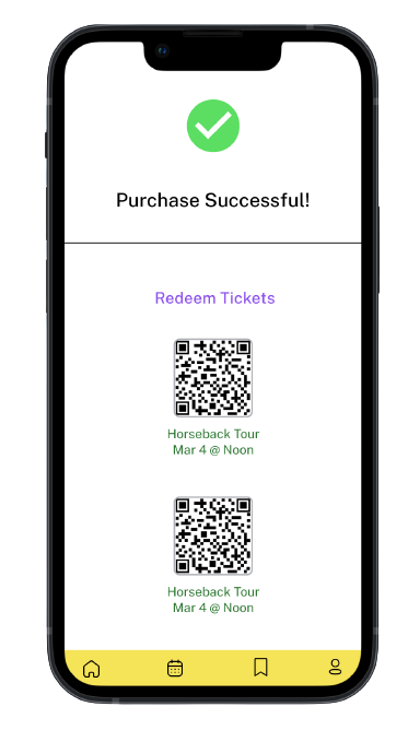
Bringing it to Life
With Tyler in mind, and drawing from the insights gathered during my research and usability study, I developed a high-fidelity prototype incorporating functionalities aimed at addressing the identified issues.
Hi-Fidelity Prototype & Design Decisions


Measuring Success
Usability Study
Developed a testing plan and script
Recruited 5 potential users
Conducted both in-person and remote testing sessions
Now that I had an improved high-fidelity prototype, it was time for more testing.

Remote usability testing session
Insights & Improvements
Before
After


“I have to go all the way to the bottom to purchase tickets.”
“I wish I could see the rating.”
*Added an additional get tickets button
*Added star rating
*Enlarged copy
“I don’t trust putting in my credit card. I would rather use Paypal.”
*Enlarged copy
*Added additional payment method
Final Design . . . for now
Iterated Prototype
Once I received user feedback on my designs, I knew there was more work to be done. I took a step back and carefully analyzed the comments, seeking to understand the areas that required improvement.
From there, I began iterating my designs, making changes based on the feedback I received. As I went through this process, I kept in mind the needs of my users and the goals of the project.


REFLECTION
Learning
Research is key! I have to refer back to the research and know:
The “why” behind all of my design decisions.
How user psychology impacted my design choices. This will ensure that the product will solve the problem and help meet the company’s goals.